In many popular leagues around the world, teams will have a company logo or name on their jersey or kit.
Soccer or football is the most popular sport in the world.
There are 209 national associations affiliated with FIFA, so the game is played all over the world. If you are a fan of the most popular sport in the world, then you probably have a favorite team or a team you like to root for.
These insane numbers are very profitable for the clubs, but do they make the jerseys look better? Some teams across Europe have many sponsors. Sometimes, they have too many company logos and names on their jersey, and their team colors are almost non-existent. The jersey is basically just a giant advertisement.
A lot of people will not admit that they like advertisements. They are sometimes very annoying, and they are everywhere, but they are everywhere and annoying because they work. That is why these companies pay thousands and millions of dollars to have their name or logo on a jersey.
I love watching the English or
Barclay’s Premier League and I usually like all of the kits the teams wear. I enjoy
every good-looking jersey as much as any other fan, but I do not like seeing or
noticing the advertisement on a team’s jersey before I notice their team’s
colors or crest. A few jerseys that have a bad combination are Newcastle
United, Manchester United and Tottenham.
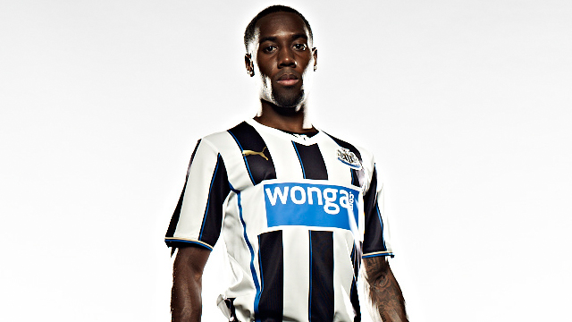 Newcastle’s 2013-2014 jersey (pictured right)
have their
normal black and white vertical stripes, but they are cut off in the middle of
the shirt by a giant, blue “Wonga” text box.Newcastle’s 2013-2014 jersey (pictured right) Because it is big and blue, it stands out more than the jersey itself. Making the colors of the sponsor similar to their team colors would make the ad blend in more. The shirt looks more like an advertisement than an actual jersey.
The same can be said for Manchester United and Tottenham’s jerseys. Manchester United’s “Aon” sponsorship is pretty big—bigger than most other teams. It is always recognizable.
Tottenham’s logo is not as big, but the circle “hp” sponsor is completely different than what most other club’s normally put on their jerseys.
In the EPL/BPL, most clubs usually have the company’s name stretched across their jersey, but the “hp” logo is not. Having the letters in the middle of a circle makes the sponsor more visible than most other jerseys in the league.
These sponsors paid lots of money to put their name on the club’s jersey, so maybe the “bad” combinations happen because the sponsor wants it to be the main focus.
They want to capture the attention of the public, and by making their advertisement clash with the jersey, people like myself will notice and talk about it.
No comments:
Post a Comment